I. OVERVIEW
Project context
Neo4j, is a leader in the cutting edge Graph database technology and is continuing to grow fast. With new entrants in the graph data base market it is critical for Neo4j to tell a compelling story and connect with developers.
THE ASK
The home page needed a refresh to better educate, engage and excite developers while maintaining lead generation. This project involved working closely with product Marketing, demand gen, developer relations and web developers to design an engaging experience for developers while meeting the business needs.
II. THE DESIGN PROCESS
RESEARCH
Used Analytics and heat map data to study user behavior, clicks, drop offs on home page and the website. Conducted in-depth user interviews and observed them browse the home page and website to understand friction points. Competitive research was helpful in understanding what best practices were market leaders adopting to engage developers.
UI/UX ISSUES
Too much clutter and poor content structure. Not enough information on what graph database is
and how it compares with other databases?Selling points are not obvious. What makes the technology unique.
New users struggled to find learning tools at their disposal.
Too many ads for books and webinar promotions are distracting.
The page looks dated.
REDESIGN GOAL
Cohesive and modern new visual design incorporating Neo4j brand guidelines.
Effectively educate and excite practitioners about graph technology and the power of graphs.
Easy access to tools for a new developer to get started.
Retain top lead generating assets.
THE NEW DESIGN
Research uncovered big gaps in our homepage content. Before proceeding with the new design I worked with our writers and product marketing to get a compelling write up on the benefits of Neo4j.
HEADER SECTION - ABOVE THE FOLD
IA/UX changes
Copy and video explaining the product have been elevated.
We want new users to first experience Neo4j through a guided sandbox. The CTA has been made prominent.
Event promotions - webinars, conferences will be promoted using a thin banner on the top. High contrast, bright colors will be used to get user attention.
UI changesThe banner runs all the way to the top .
The color palette has been limited to green, the primary brand color along with grays and coral for CTA.
WHY IS NEO4J THE RIGHT DATABASE FOR YOU
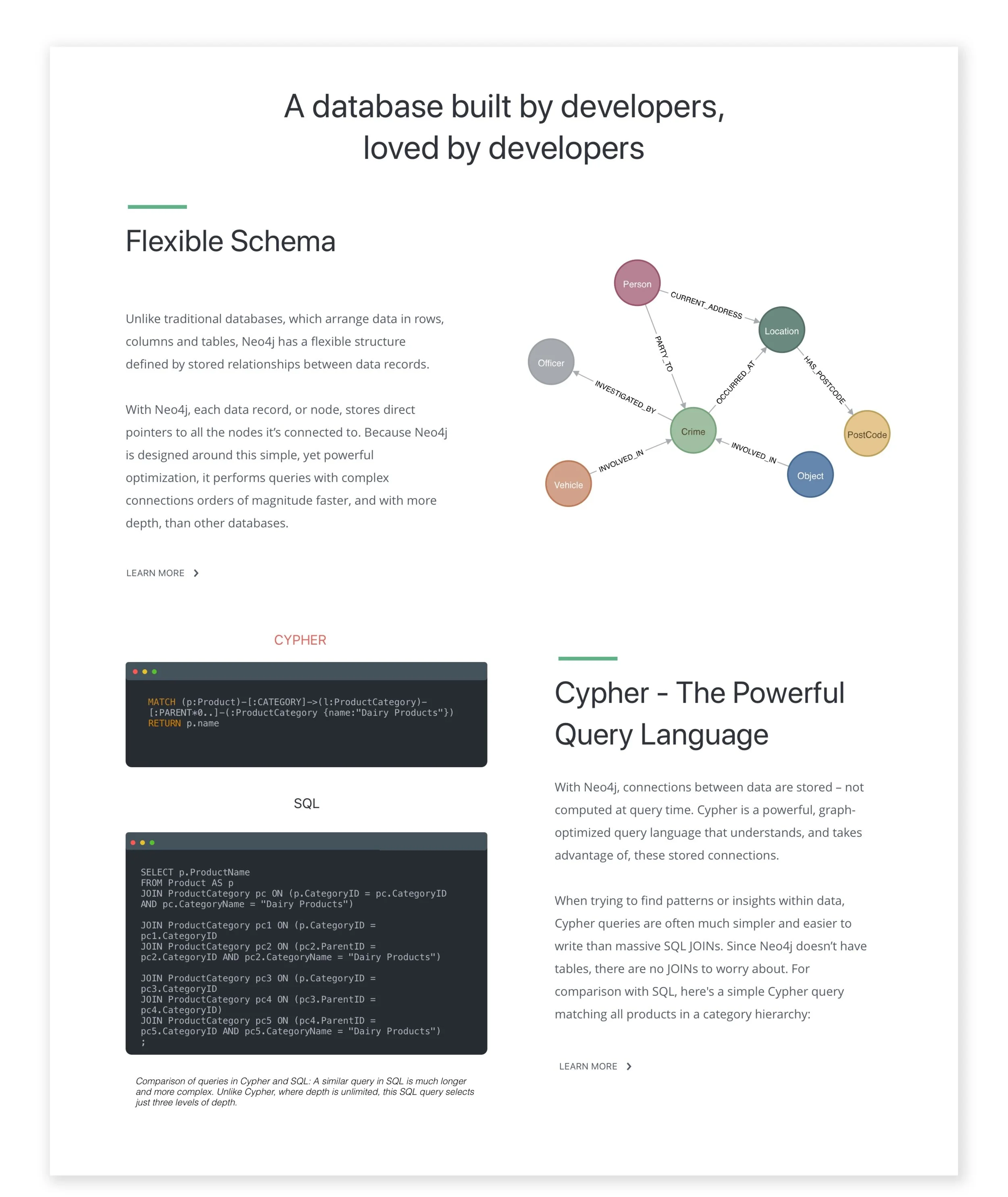
A dedicated section to highlight the advantages of Neo4j.
Showcase product features which make development cycles shorter and improve performance over other databases.
Getting Started
Offer multiple learning resources and paths for getting started.
III. NEXT STEPS
Each design change will be A/B tested against the old design to evaluate user behavior shift and impact on lead generation.
Design is being tested with a focus user group to evaluate usability.
Next steps will be to add additional visual elements - textures, stylized graphs etc.


